Community Feedback
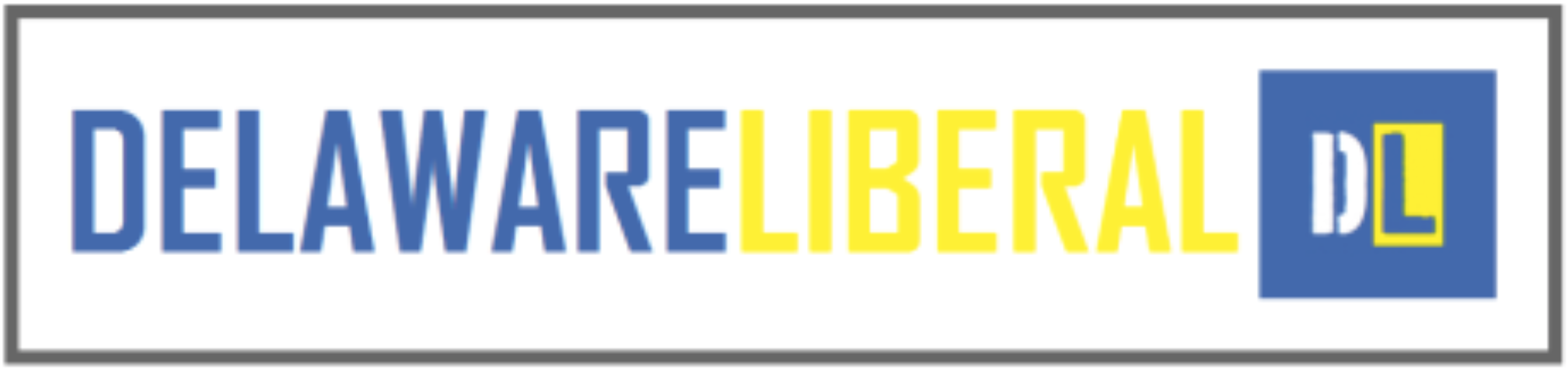
We here at Delaware Liberal are preparing to upgrade the site design. It is coming soon, but not immediately. Part of that site redesign is a possible redesign of our logo. The current logo and the secondary logo have been in use for a year now. We may not change it, or we may just tinker with the font and color. But this has allowed me to indulge in a hobby of mine: graphic design. So I have developed some new logos that I want to share with the community to get your feedback. Now, some of these logos were met with horror and disgust on the part of my fellow Delaware Liberal contributors. So it is possible that even if you all love them, they won’t be used. Indeed, we even have a professional designing a logo, but that one is not ready yet.
So, just let me know what you think:


I don’t know why, but the font makes me feel sorta Big Brotherish. This is a totally viseral reaction, I don’t have any rational reason here.
First is best.
I like the logo we have now.
Big Brother as in the reality series or as in the novel about a fascist 1984 world?
My favorite is the third one, but I also like our current logo and the first one.
As in 1984 – don’t know about the reality series ;o).
I’d stick with the original. Although I might amp up the colors.
Agree about amping up the colors, akym.
I still like the first one too…but…the quarter is only black and white. I would go for toning the quarter, because that is where liberals do their best work…discussing the grey…and advocating for the grey. I really mean that. I’m not being snarky gang, truly.
‘Bulo prefers the current logo. But shouldn’t Sacagawea be on the coin?
I do like the sharper quarter in the first choice better than the current logo quarter.
Joanne,
I don’t know if it’s advocating for the gray as much as acknowledging that it exists.
Current logo is sharp, but wasn’t Mike Castle behind the state quarter program?
yes anon–I call them “Castle Mints”. Maybe you guys need to switch off to the peso at this point.
I don’t like any of them, in particular. You can hire professional logo designers in India to work on a nice logo for <$200. They’ll keep trying until they get one you like.
Try logocare.com or something similar.