Last week LiberalGeek took a comment I posted about the Smarter Balanced Assessment (SBA) scores and turned it into a graph.
Basically, LG took this:
School (RCCD 5th)……..PLI………..ELA 2015……..MATH 2015
North Star……………….3.8%………….92.2%…………..76.1%
Brandywine Springs…..9.0%………….85.4%…………..70.3%
Linden Hill……………….9.9%………….75.7%…………..59.6%
Heritage…………………22.1%…………60.2%…………..23.7%
Forest Oak……………..37.2%………….59.0%………….46.2%
Richey……………………39.3%…………43.8%…………..35.1%
Marbrook……………….51.4%…………41.0%…………..28.6%
Mote……………………..52.2%…………48.5%……………22.8%
Baltz……………………..58.1%…………35.0%……………13.5%
Richardson Park………61.4%…………29.5%……………..7.7%
Highlands………………65.2%…………32.2%……………10.0%
Lewis Dual Lang……..73.2%………….20.4%…………….7.1%
Shortlidge………………81.0%…………18.3%……………16.4%
Warner…………………..82.6%…………..5.0%……………..2.5%
And turned it into this:
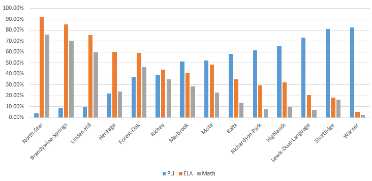

Amazing, no?
Below you will find charts of the four districts that serve city of Wilmington students (click on charts below to enlarge). You will also find a chart of Charter Schools. Pay attention to the trend lines. Some are more obvious than others.
Before I continue, let me say this: I do not support the SBA, but since we’ll be using these scores to judge and label students, teachers and schools we need to look at the data. This test will have consequences.
Colonial
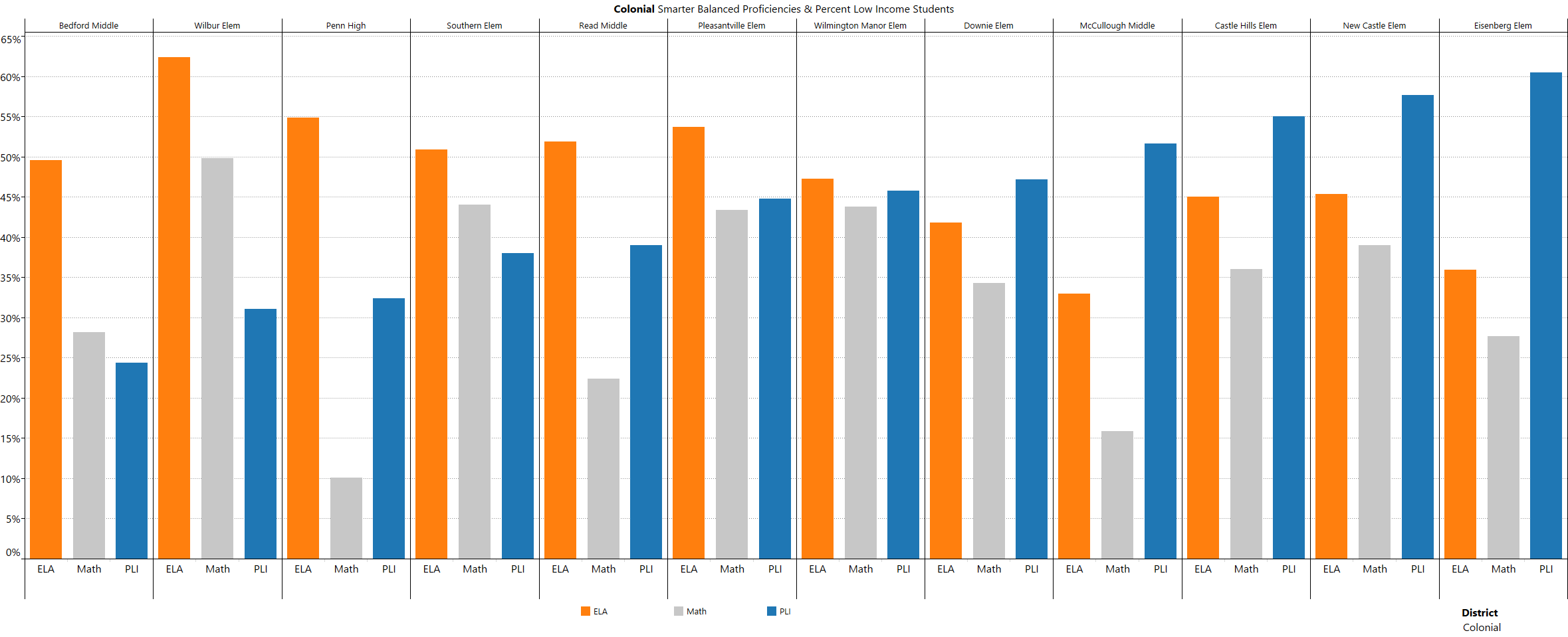
I’m not very familiar with Colonial so I asked Brian from Those In Favor blog (a blog everyone should be reading, btw) to share his thoughts. Here’s what he says: Colonial has several hundred students that are bused out of Wilmington to the District and back each day. You are correct that they do not have a school in the city, but they do educate a sizable number of children and those children live in areas affected by poverty so I think they are part of this, too. That’s a big question mark for WEIC. Colonial has no buildings in Wilmington, but their students will be transferred to Red Clay…so where will they attend school?
Good points, Brian. Thank you!
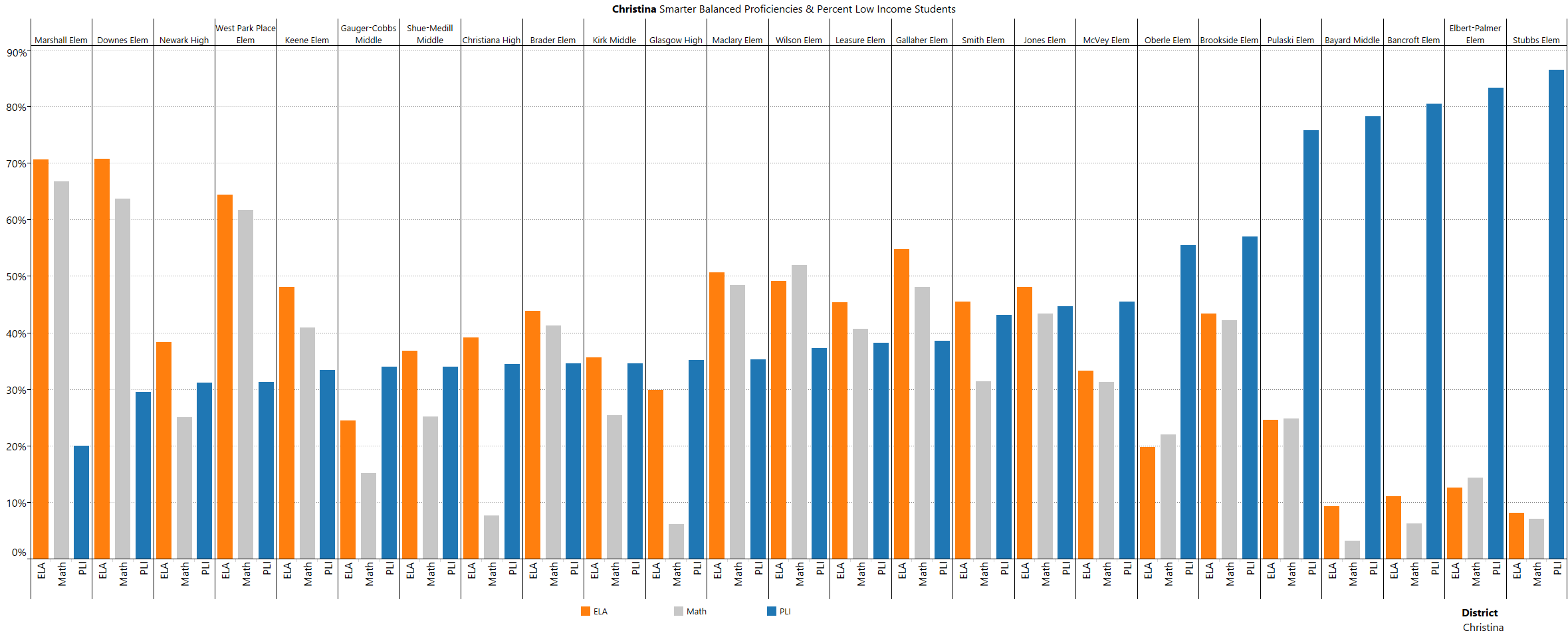
Christina School District
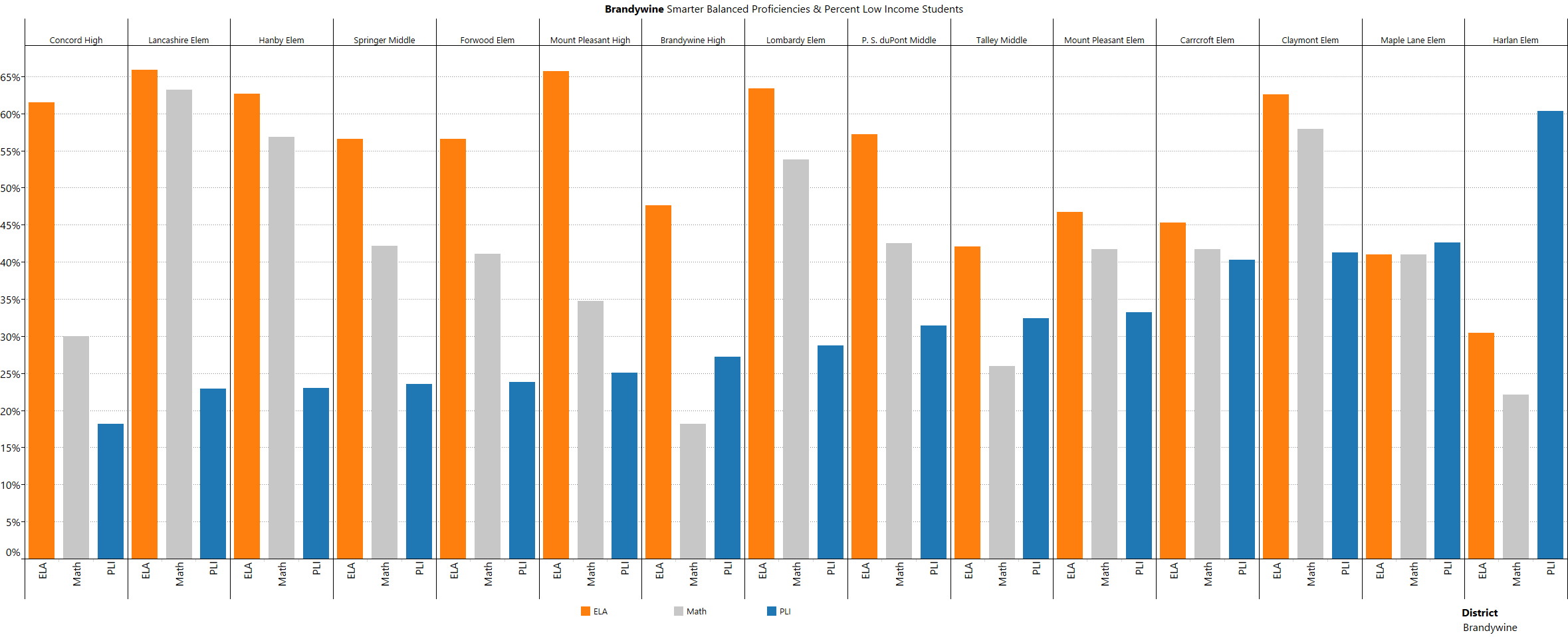
Red Clay School District
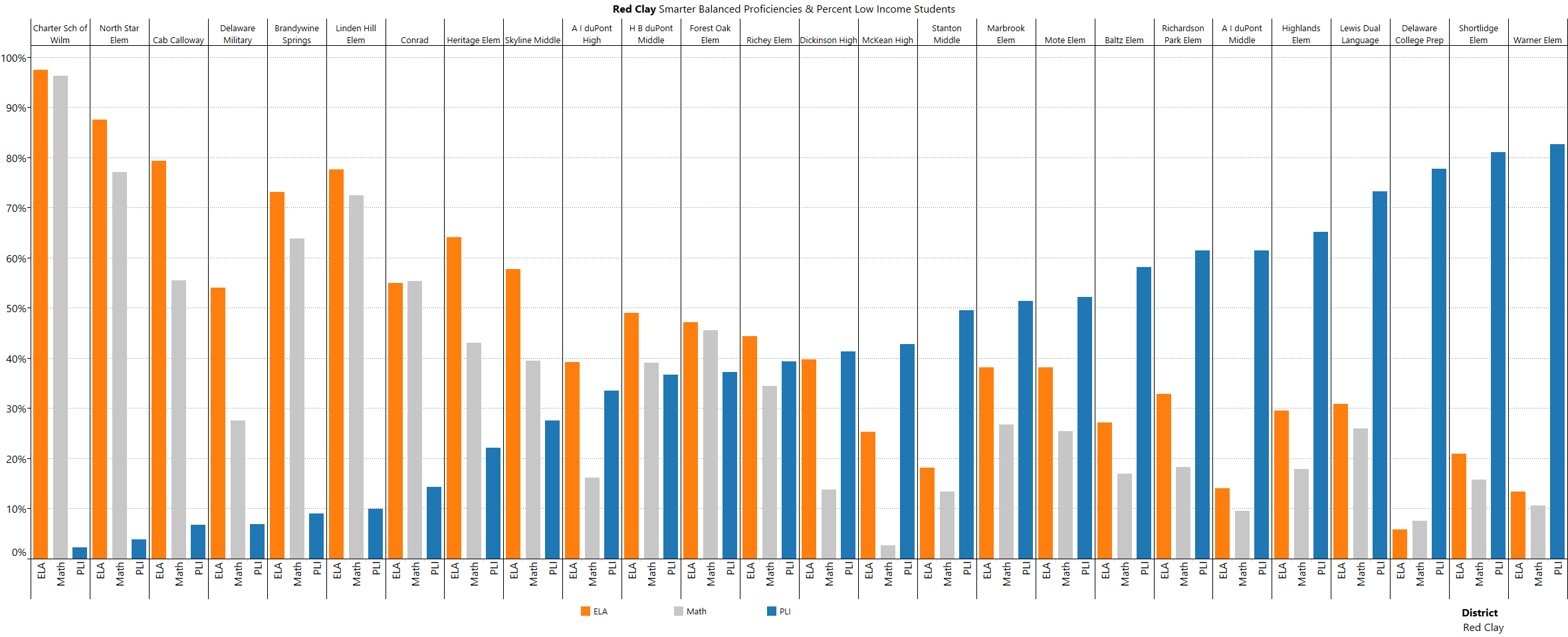
Gotta hand it to Red Clay. The pattern is amazing… almost deliberate? Wow. Are we really considering giving Red Clay (RCCD) more of our city children? I’m not comfortable with that decision. Take a look at the three high schools (A.I., Dickinson and McKean) that everyone in Red Clay is assigned to and ask yourself this: Are you okay with buying a house that comes with a high school lottery ticket? Don’t kid yourself, property values are affected, and going by this chart it’s no longer just city property values. Mike O. and I called this several years ago. We said what was happening in the city would spread outward.
17 out 26 RCCD schools of are below the 50% mark on the SBA. Nine schools are above it. Four of those nine schools are charters and/or magnets – which means to gain entry a student has to complete an application, and/or audition, take a “placement” test, etc.. The five public schools above the 50% line consist of four elementary schools (which come with attendance zones) and one middle school. That’s a pretty poor track record. Hmmm… we probably need a chart showing RCCD’s public schools only – schools that have an attendance zone and don’t require any applications for admission.
Which brings me to WEIC – Wilmington Education Improvement Commission. I don’t envy this commission one bit. The task before them is daunting, especially given the inevitable push back heading their way. But I have to ask this: Given Red Clay’s chart above, why would anyone think RCCD would be a good choice for our highest needs kids? If WEIC goes down this path with RCCD then the conditions/rules/funding, etc. must be carved in stone. Remember how the Priority Schools had a “punishment” attached if the schools didn’t improve? May I suggest attaching something similar to RCCD if they continue on the path they’re on? Joking? Sorta. Not really.
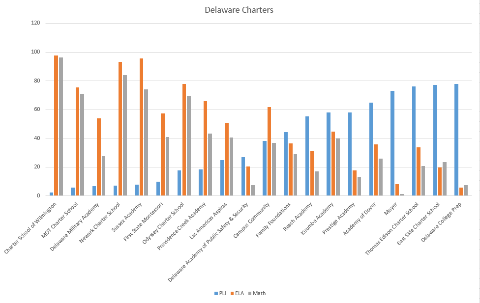
Look at that! It’s almost as pretty as Red Clay’s chart.
First, can we finally put to rest the myth that charters perform better than public schools. For schools with the luxury of controlling their population you’d think this chart would look different. When it comes to poverty, even charters aren’t immune.
Second, I guess we’ll have quite a few charters being labeled Priority Schools.
I’m really not sure what else to say about charters. This chart shows that they are a failed experiment. When you look at “successful” (and boy am I using that term loosely) charters it’s easy to see that their “secret sauce” is who they let into their school and not what goes on in the classroom. And our tax dollars are funding this. Meanwhile, true public schools continue to lose money, programs, teachers, etc. – they also have to take all students, even the ones charters don’t take or keep.
The only silver lining I see with the Charter School chart is that a lot of people are going to need to sit down and be quiet about Charter awesomeness. It simply isn’t true.
In closing I want to take a moment to thank all the people who spent a large part of their holiday weekend (and are still working, and will be working for quite some time) compiling data, checking figures, making charts, etc.. Everyone was amazing. So hats off to LiberalGeek who started it all and continues to help chart; to Brian of Those In Favor blog for creating spreadsheets and charts – if you aren’t reading his blog you are missing out. Thanks to Kevin Ohlandt for his data checking and contagious passion. Kevin has become a leading voice in Delaware Education with his blog, Exceptional Delaware. (Go read him!) And a special thank you to Rep. Kim Williams who tirelessly answered our questions and helped review mountains of data.
Exceptional Delaware has a post up on this issue, as well. Go Read It!
Here’s an excerpt:
What Governor Markell seems to lack insight into or just plain ignores is the impact of poverty on children’s education. It isn’t something “rigor” and “grit” can fix. It’s a matter of increasing the funding to these schools, and not under the guise of priority schools or focus schools. It means lowering the size of classrooms, increasing special education funding, and judging children based on a once a year test the clearly shows how much poverty does matter. The Smarter Balanced Assessment is not improving education. It is making it more difficult for schools to get the true reform they need.
And… buckle up. More charts are coming!