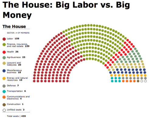
Congressional Seating Charts — If They Were Seated By Their Funders
Mother Jones magazine has a fantastic special report that they’ve called Who Owns Congress? There are articles and great graphics showing the biggest 527s operating this cycle, the most generous individual donors, the top 75 corporate donors among other reports and analyses.
The most interesting thing here (IMNSHO) is a rethinking of how Congress gets seated — if they were seated in accordance with who sponsors them:

Click on the graphic to get to the article where the top congress people paid by various sectors are shown.
Remember when Dick Durbin said that “the banks own the place”? You can make the argument from this seating chart that there isn’t anybody in Congress whose real job is to represent the interests of the people who they want to vote for them.
h/t The Big Picture
Tags: Campaign Finance


Wow! That’s depressing.
Labor needs to buy some Senators, fast.
Looking at the representation of labor in the House vs. the Senate, you have to wonder if there is not a conscious corporate strategy to buy up the Senate to block anything coming out of the House. It would explain a lot.
Thank you very much for the info. It says a lot.