Delaware Liberal will be getting a site redesign soon, and whenever we redesign the site, I have fun with the logo.
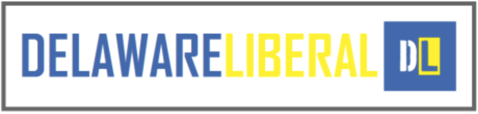
Our current logos:


And here are two sets of logos that I have drafted up. Tell me what you think. The first set harkens back to when we had the state quarter with Caesar Rodney facing left.


The next set plays on our current logo, but adds the state outline into the D.


Tell me what ya think.
I think you should highlight the area in sussex that is under the stewardship of Lord Sheriff Christopher the Bold.
“Presenting his sovereign eminence, Lord Christopher I, by the Grace of God, Sherrif of Sussex, Duke of Georgetown, Earl of Bethany, Count of Laurel, Marquess of Milton, Defender of the Beach, etc.”
The “D” in all the logos you have drafted are a problem. I think both the D and the L in the first two are too narrow. What worked for the current logo is not just the color differential between the letters, but the style differntial as well.
The bottom one is the best of the four, but the Delaware silhouette does not quite work as the cut-out for the D–too much solid white space. What if you extended an arc of light blue (sea) out from the Delaware to form the interior of the D. I think that would balance it out better.
once again, that tiny patch of Delaware across the river, unfortunately attached to NJ has been left out.
Ben, that would be one pixel. LOL.
Steve, I agree with you. I will play around with your suggestions. I actually prefer the first set but I may be outvoted by my colleagues whom I think never warmed to the quarter.
I feel so geeky that graphic design is a hobby of mine.
Michael Stafford, local ex-GOP official, writes Why I Gave Up On Being A Republican.
I don’t like the quarter designs. I like the DE quarter as coins go. I just don’t like it in our logo. What does that say to have images of money on the masthead?
Hmmm. Good point.
K.I.S. I like the current stencil type logo, myself. The quarter’s too complicated. But I really like the addition of the black. Might a black background solve the insert issue?
I like the current one too. If you are trying to add the state of Delaware wouldn’t it make more sense to put it in the “L” and leave the “D” like it is? IMO . . .
If you use the state image it has to go in the D not the L. Reason: D=Delaware L=Liberal. Makes no sense the other way.
I kind of like the quarter, too, How about putting it behind the D, showing through the center of the D, so that you get the Caesar Rodney image that is well known but it breaks up the “coin” part of the image sufficiently that it is not “money” any more?
If you’re going to change, go with the button. It’s political, and what’s what you are.
No quarters please. They were a Castle idea, and he got O’Donnellized.
I think you should extend Sussex County like the ferry going across….and then you have the “L” looking like the State of Delaware within the D. But I know you guys never listen to me…..and I’m still one of your biggest fans.
Good one mediawatch…the only change you want is buttons 🙂
http://www.hamilton.edu/magazine/spring12/departments/point-of-view
“A moderate’s Plea” by Mike Castle
We always listen to you Joanne. We just might not agree all the time. 😉
These are all good suggestions and I will try each out and repost the new drafts in a coming open thread.
Don’t look now, but Chip’s astroturfers are freeping the poll.
the ones with the quarters make it look like you’re the “DLO”
Not surprisingly, Castle had zero new insight to offer, and we already know his party isn’t listening to him.
Stafford’s story, on the other hand, has real declarative punch.
I like the button design. I would keep the L as it is, but replace the D with the large, white D that has the outline of Delaware for its hole. The deep blue background of the button ends up forming the Delaware shape and the L. The white and gold should give it some punch.
“It ain’t mean enough. Put some blood in there. Show somebody gettin’ hurt. A groin injury. Get some t–s in there! Put a ‘For Sale’ sign!”
– Reggie Dunlop, “Slap Shot,” 1977
“once again, that tiny patch of Delaware across the river, unfortunately attached to NJ has been left out.”- ssshhh Ben, that is secret and sacred ground.. where the Jersey teens have been going to party for decades thinking it is unclaimed land. (and guess what, it kinda is) 😀
30 consecutive votes have come in for Denn in half an hour. Flowers led 76-62 prior to the Freeping.
Make that 35. 5 more for Denn while I posted. Hilarious.
What, you think all those votes for Flowers were from “real people”?